ShopDreamUp AI ArtDreamUp
Deviation Actions

ProjectComment is a Group of many projects centred around comments, but, more importantly, constructive comments. We offer Members of deviantART a lot of opportunities to get comments, give comments, participate in comment projects, win points, get featured and much, much more!
In this series of articles, our admins aim to answer questions about anything related to comments/commenting, art and more! Here are our answers to the questions:
 How do you draw and colour/shade things made of metal?
How do you draw lights and glowy things (especially if you don't have things like gimp or photoshop)?
 &
&  , Felizias recommends this tutorial and Astrikos recommends this tutorial.
 suggests, "I think this question leads a more fundamental one: how to draw different textures.
I never used a lot of metal in my works. Though, I think the basic steps for drawing materials are similar.
First of all I try to find a reference, because there are different kinds of metals fav.me/d5odx56
It's important to keep in mind what kind of lightning your artwork has. Every surface is not perfect, so I usually use some textures/brushes to show dirt, rust and cracks.
This tutorial explains a lot about metal: fav.me/d6zrct7
This is a drawing process, but I find it very helpful: fav.me/d6rn62u
Maybe they look like an advanced level, but I encourage you to try them. Just use a simple form for an exercise."
recommends these tutorials: Digital & Traditional
 suggests, "For digital programs there are brushes you can also use (too less experience to explain how it would work by hand).
:thumb117052892: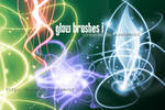


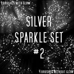

There are so many - just enter "brush glow" into the search panel and pick what you need - don't forget to check the terms of use (there are a lot of free sets!) and make sure to leave a very kind thank-you-comment on the providers profile or the deviation. Remember that those people work for you and do not only deserve but also need your support.
In traditional I make sure I leave the spot I want to glow white and cover the rest at least slightly. The very source of light always stays perfectly white and then you start to colour the direction of the glow very softly in the colour you want to have it in. (In graphite you differ in the value - it needs to stay lighter than the unlighted areas...)"
 suggests, "Regardless of what software you're using, or if you're going traditional and have no software, I think light is all about contrasting values.
Have a look at this picture: sergemeeus.deviantart.com/art/…
The cave mouth doesn't actually glow, but it looks like it does because the value used for it is might lighter than the rest of the image.
You can achieve this effect using traditional means, here are some examples: www.deviantart.com/art/The-Lig… & bongoshock.deviantart.com/art/…
The trick to it is to leave the glowing part of the paper untouched by your medium, well with any sort of pencils that's true. Anyway, you leave the white of the paper there and add the medium lightly around it, essentially a circular value scale around that spot. The strong light to dark contrast will appear to be glowing, regardless of the color you use.
To maintain that you have to preserve that contrast. This might mean making the rest of your image darker. If nothing else in your image has the same value as the spot you want to glow, then it will look like it's glowing. As soon as non-glowing objects get the same light value, it will ruin the glowing effect.
Working digitally you can erase back to pure white to add the glowing effect. With any sort of pencils there's no way to return back to pure white once you've put marks on the paper. It's possible some white paints can achieve brighter whites, I haven't used them as much to know."
suggests, "I usually use soft round brush to show the glow around an object.
Also it's important to show the reflected light on the surface and other objects.
I want to add this tutorial, it explains how to achieve glow without any photoshop effects: fav.me/d4jag2p "
 suggests, "In addition, it might help to learn the difference between hard and soft lighting. Soft is generally the more common and more practical, where surfaces very gradually get darker with distance from the light source. However, with hard lighting, the darkest shadows can be directly adjacent to the highlights (Google image search "hard lighting photography"). Choosing hard or soft, helps with different approaches to contrast, tone, glow, and of course, lighting. If you're using digital and it has a threshold option/feature/filter, try it out, and look at how you can transform your picture to just pure black and white.
It's unclear what media you're using, but with pencil/black and white, it is pretty straightforward, boiling down to varying the pressure for the shading on the canvas, and understanding lighting. A good eraser can help with fine-tuned highlights. Getting a smooth gradient however takes practice.
As for color, I keep the source of the glow a solid color, such as white, turquoise, neon green etc. and with digital I use a low opacity brush of the solid color either around the form/subject or on the surrounding surfaces, and to create the gradient, gradually decrease the opacity the further out from the source."
Do you have any suggestions? If so, post them here!
If you have questions that you would like us to answer, please ask here as a reply to this blog, or anonymously through this form. Our volunteers will then answer your questions to the best of our abilities, and we will then post our answers as an article for you!
Thank you for reading!
ProjectComment
In this series of articles, our admins aim to answer questions about anything related to comments/commenting, art and more! Here are our answers to the questions:
How do you draw and colour/shade things made of metal?
& , Felizias recommends this tutorial and Astrikos recommends this tutorial. suggests, "I think this question leads a more fundamental one: how to draw different textures.I never used a lot of metal in my works. Though, I think the basic steps for drawing materials are similar.
First of all I try to find a reference, because there are different kinds of metals fav.me/d5odx56
It's important to keep in mind what kind of lightning your artwork has. Every surface is not perfect, so I usually use some textures/brushes to show dirt, rust and cracks.
This tutorial explains a lot about metal: fav.me/d6zrct7
This is a drawing process, but I find it very helpful: fav.me/d6rn62u
Maybe they look like an advanced level, but I encourage you to try them. Just use a simple form for an exercise."
How do you draw lights and glowy things?
recommends these tutorials: Digital & Traditional suggests, "For digital programs there are brushes you can also use (too less experience to explain how it would work by hand).:thumb117052892:
There are so many - just enter "brush glow" into the search panel and pick what you need - don't forget to check the terms of use (there are a lot of free sets!) and make sure to leave a very kind thank-you-comment on the providers profile or the deviation. Remember that those people work for you and do not only deserve but also need your support.
In traditional I make sure I leave the spot I want to glow white and cover the rest at least slightly. The very source of light always stays perfectly white and then you start to colour the direction of the glow very softly in the colour you want to have it in. (In graphite you differ in the value - it needs to stay lighter than the unlighted areas...)"
suggests, "Regardless of what software you're using, or if you're going traditional and have no software, I think light is all about contrasting values.Have a look at this picture: sergemeeus.deviantart.com/art/…
The cave mouth doesn't actually glow, but it looks like it does because the value used for it is might lighter than the rest of the image.
You can achieve this effect using traditional means, here are some examples: www.deviantart.com/art/The-Lig… & bongoshock.deviantart.com/art/…
The trick to it is to leave the glowing part of the paper untouched by your medium, well with any sort of pencils that's true. Anyway, you leave the white of the paper there and add the medium lightly around it, essentially a circular value scale around that spot. The strong light to dark contrast will appear to be glowing, regardless of the color you use.
To maintain that you have to preserve that contrast. This might mean making the rest of your image darker. If nothing else in your image has the same value as the spot you want to glow, then it will look like it's glowing. As soon as non-glowing objects get the same light value, it will ruin the glowing effect.
Working digitally you can erase back to pure white to add the glowing effect. With any sort of pencils there's no way to return back to pure white once you've put marks on the paper. It's possible some white paints can achieve brighter whites, I haven't used them as much to know."
suggests, "I usually use soft round brush to show the glow around an object.Also it's important to show the reflected light on the surface and other objects.
I want to add this tutorial, it explains how to achieve glow without any photoshop effects: fav.me/d4jag2p "
suggests, "In addition, it might help to learn the difference between hard and soft lighting. Soft is generally the more common and more practical, where surfaces very gradually get darker with distance from the light source. However, with hard lighting, the darkest shadows can be directly adjacent to the highlights (Google image search "hard lighting photography"). Choosing hard or soft, helps with different approaches to contrast, tone, glow, and of course, lighting. If you're using digital and it has a threshold option/feature/filter, try it out, and look at how you can transform your picture to just pure black and white. It's unclear what media you're using, but with pencil/black and white, it is pretty straightforward, boiling down to varying the pressure for the shading on the canvas, and understanding lighting. A good eraser can help with fine-tuned highlights. Getting a smooth gradient however takes practice.
As for color, I keep the source of the glow a solid color, such as white, turquoise, neon green etc. and with digital I use a low opacity brush of the solid color either around the form/subject or on the surrounding surfaces, and to create the gradient, gradually decrease the opacity the further out from the source."
Do you have any suggestions? If so, post them here! 
If you have questions that you would like us to answer, please ask here as a reply to this blog, or anonymously through this form. Our volunteers will then answer your questions to the best of our abilities, and we will then post our answers as an article for you!
Thank you for reading!
ProjectComment
Magic Week - Reverse Caption
The power flowed into him, filling his lungs, spreading out in his blood like oxygen, and settling into the marrow of his bones. He felt himself smile in a way that he hadn't since he was a boy learning to cast his first spell. He had devoted decades to the study of magic, but now, now he was magic. A glow lit the trees around him. He couldn't be sure if it was the setting sun, or if the glow came from his own skin. A beetle crawled on the ground nearby, seemingly unconcerned with what it had just witnessed, but yet its movements were in time with his heartbeat. A bird in the sky flapped its wings to the same rhythm. A breeze plucked at his hair and clothes. He began to dance, slowly at first; he followed the wind, and the wind followed him. He moved faster, twirling and leaping, until even the fallen leaves were dancing around him. When he stopped, all was still. He smiled again, and raised his arms to the sky. The first stars were visible. He watched them for a long
Feature of Great Commenters: July
As a result of our Nominate a Commenter + Win 100 Points project, we will be announcing the winners of those 100 and bringing you features of our great commenters every month! Week of 13th - 27th June Congratulations @Frozen-Faeriefyre for winning 100 :points: ! Feature of Great Commenters! @Anukisima, @BeckyKidus, @bioniclop18, @DoubleDandE, @lightLast, @Sori-Eminia, @VonGrechii, @Ymrabelle Week of 27th June - 11th July Congratulations @Dragon-Beans for winning 100 :points: ! Feature of Great Commenters! @Anukisima, @DoubleDandE, @kmkibble75, @lovelyHanibal, @raichmann, @Sori-Eminia, @Souvillaine, @StephOBrien, @TheCrimsonSpark, @Ymrabelle If you would like the chance to win 100 :points: or be featured, nominate a commenter now!
Submit Freestyle + New Theme
Theme Submissions for This Week We accept 1 deviation a day to Theme! Theme: Toys, suggested by LDFranklin Theme Description: Photographs of objects that children play with. Starts: Sunday, August 2nd Ends: Sunday, August 9th Send in your submission >HERE< by suggesting it as a favourite. The best submissions will be added to the gallery! Weekly Feature Many thanks to LDFranklin for suggesting this week's theme! Check out their art now! Last Week's Theme Submissions: Reflective Theme Submissions Info for Next Time Theme: New, suggested by Coigach Theme Description: TBA Starts: Sunday, August 9th Ends: Sunday, August 16th Pending Themes Borders & Edges, suggested by AlejaOlch HDR, suggested by AlejandroCastillo Murky, suggested by Laerian Delicate, suggested by crestmultimeadia Open Landscapes, suggested by Lumimyrskydawn Odd, suggested by Abnormalion Street Art, suggested by jlxp Fluffy, suggested by AlejaOlch Nature in Cities
No Constructive Comments #61
ProjectComment has been an active group since 2009 to give you the constructive comments you deserve! What better way to do that than to give and get constructive comments on the artworks that have none in our No Constructive Comments project? Comment on some of the pieces below today, and link us your comments for a chance to be featured in our monthly newsletter!
Featured in Groups

© 2014 - 2024 3wyl
Comments0
Join the community to add your comment. Already a deviant? Log In