ShopDreamUp AI ArtDreamUp
Deviation Actions
ProjectComment is a Group that provides Guaranteed & Constructive comments for the DeviantArt community.
In order to support those efforts, we encourage dedicated users to give comments too. For those who are critics, artists, or just helpful in the community, we now offer something in return for all that you do - be it helping the participants of ProjectComment, or the group itself!
This weekly article focuses on the amazing deviants in the DeviantArt community, who have given fantastic comments, through excerpts of those comments, artwork by the deviants themselves, and much more! Your support in the article would be much appreciated.
 , stargazerlily8D, Varied, Hobbyist
Commented on A Risky Birthday Present: Postal Edition by ToddNTheShiningSword.
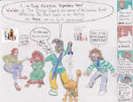
" Composition
You said that you do a comic and I think that is amazing. I give credit to people who do comic book stuff. However, I'm sure as you know every comic strip has a composition. Right now this picture doesn't have much of a composition at all. You have what looks like smaller comic pages in the background, but they are just floating there. Then, there is the person who appears to be sitting, but again she is floating. Having a nice set background, even if it is a wall would help to show that they are not floating in space. Also, remember that if a person is standing on the ground there should be a sign of pressure and shadow. Anything that is pushed against, or set upon something creates pressure.
Another thing to remember is perspective. Every piece even comic strips has a horizon line. Make sure that the viewers eyes are at a set area. Objects closer to them will appear bigger, those farther away will appear smaller. The little creature that you have drawn is closer to the viewer so it should be slightly bigger, the woman sitting looks farther away so she should be smaller. Having a defined horizon line and projecting your lines outward will help you solve not only what objects are bigger and smaller, but making the characters appear as if they are standing on solid ground. [...]"
Here is a selection of art created by stargazerlily8D.
:thumb501125604: :thumb464031010: :thumb448582698:
Have a browse of their Gallery!
 , Queen-iee-oh, Digital Art, Student
Commented on new oc htf Tami by Faithy-The-Squid.
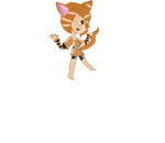
"You have tons of potential! Normally a cat girl is a little overdone. The sleeves are a very nice and cute edition.
Also her feet are very nice and pointed! Also you are good with thinking of cute expressions.
Yet there are quite a few anatomy issues.
arms are odly as long or even longer then her legs. ( your legs are about twice the size of your arm )
Her neck and chest are twisted and need to be more aligned along her spine. [...]"
Here is a selection of art created by Queen-iee-oh.
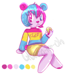

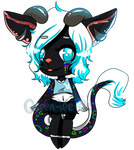
Have a browse of their Gallery!
 , Acolet, Deviant Member
Commented on Study #1 by Lxbo.
"A little bit of advice, just because I've been doing the same thing for very long - sometimes less contrast is more.
Notice how her skin in the reference has all the values very close together, there's the base shade and the lightest point is only a bit lighter, similarly, the shadow is only a little darker. While in your picture you have much more contrast in her skin. Similarly the shirt, hair and mouth.
Now, this in itself is not a flaw, by all means. I'm pointing it out for three reasons - less contrast means less unnecessary work for you,
-it would actually look more realistic
-the main reason: contrast bring attention. So if you lower the contrast on skin and shirt, the attention of a viewer will automatically go to the highest contrast area - the eyes. And that is, generally when painting portraits, exactly what you want. In the same fashion, you could make the whites of her eyes whiter, to pop the contrast more. [...]"
Here is a selection of art created by Acolet.


Have a browse of their Gallery!
:thumb525149248: :thumb528144555:
If you want to be in for the chance of being featured, feel free to submit to this folder!
We need nominations of deviants who you think should be featured! Send us a note with the subject "Nomination" and the following information:
 You can suggest anyone and everyone (except yourself
  ) at any time and include as many nominations as you want in one note.
 The news feature occurs once every week and all nominations will be taken into account.
 If your nomination isn't featured immediately, it may still be featured in a future news article!
3wyl, posting on behalf of ProjectComment
In order to support those efforts, we encourage dedicated users to give comments too. For those who are critics, artists, or just helpful in the community, we now offer something in return for all that you do - be it helping the participants of ProjectComment, or the group itself!
This weekly article focuses on the amazing deviants in the DeviantArt community, who have given fantastic comments, through excerpts of those comments, artwork by the deviants themselves, and much more! Your support in
Spotlight Commenters
These commenters are determined by you through Nominations (read below for more information). Each month, we will be selecting a couple of amazing commenters based on the comments we have seen in our gallery submissions and elsewhere on DeviantArt. Anyone on DeviantArt is applicable for this feature!Commented on A Risky Birthday Present: Postal Edition by ToddNTheShiningSword.

"
You said that you do a comic and I think that is amazing. I give credit to people who do comic book stuff. However, I'm sure as you know every comic strip has a composition. Right now this picture doesn't have much of a composition at all. You have what looks like smaller comic pages in the background, but they are just floating there. Then, there is the person who appears to be sitting, but again she is floating. Having a nice set background, even if it is a wall would help to show that they are not floating in space. Also, remember that if a person is standing on the ground there should be a sign of pressure and shadow. Anything that is pushed against, or set upon something creates pressure.
Another thing to remember is perspective. Every piece even comic strips has a horizon line. Make sure that the viewers eyes are at a set area. Objects closer to them will appear bigger, those farther away will appear smaller. The little creature that you have drawn is closer to the viewer so it should be slightly bigger, the woman sitting looks farther away so she should be smaller. Having a defined horizon line and projecting your lines outward will help you solve not only what objects are bigger and smaller, but making the characters appear as if they are standing on solid ground. [...]"
Here is a selection of art created by stargazerlily8D.
:thumb501125604: :thumb464031010: :thumb448582698:
Have a browse of their Gallery!
Commented on new oc htf Tami by Faithy-The-Squid.

"You have tons of potential! Normally a cat girl is a little overdone. The sleeves are a very nice and cute edition.
Also her feet are very nice and pointed! Also you are good with thinking of cute expressions.
Yet there are quite a few anatomy issues.
arms are odly as long or even longer then her legs. ( your legs are about twice the size of your arm )
Her neck and chest are twisted and need to be more aligned along her spine. [...]"
Here is a selection of art created by Queen-iee-oh.


Have a browse of their Gallery!
Commented on Study #1 by Lxbo.
"A little bit of advice, just because I've been doing the same thing for very long - sometimes less contrast is more.
Notice how her skin in the reference has all the values very close together, there's the base shade and the lightest point is only a bit lighter, similarly, the shadow is only a little darker. While in your picture you have much more contrast in her skin. Similarly the shirt, hair and mouth.
Now, this in itself is not a flaw, by all means. I'm pointing it out for three reasons - less contrast means less unnecessary work for you,
-it would actually look more realistic
-the main reason: contrast bring attention. So if you lower the contrast on skin and shirt, the attention of a viewer will automatically go to the highest contrast area - the eyes. And that is, generally when painting portraits, exactly what you want. In the same fashion, you could make the whites of her eyes whiter, to pop the contrast more. [...]"
Here is a selection of art created by Acolet.


Have a browse of their Gallery!
Do you know of a potential Spotlight Commenter? If so, we take nominations. Feel free to note ProjectComment!
Comment?
Consider commenting on one or more of the below!:thumb525149248: :thumb528144555:

If you want to be in for the chance of being featured, feel free to submit to this folder!
How To Nominate
We need nominations of deviants who you think should be featured! Send us a note with the subject "Nomination" and the following information:
3wyl, posting on behalf of ProjectComment
Magic Week - Reverse Caption
The power flowed into him, filling his lungs, spreading out in his blood like oxygen, and settling into the marrow of his bones. He felt himself smile in a way that he hadn't since he was a boy learning to cast his first spell. He had devoted decades to the study of magic, but now, now he was magic. A glow lit the trees around him. He couldn't be sure if it was the setting sun, or if the glow came from his own skin. A beetle crawled on the ground nearby, seemingly unconcerned with what it had just witnessed, but yet its movements were in time with his heartbeat. A bird in the sky flapped its wings to the same rhythm. A breeze plucked at his hair and clothes. He began to dance, slowly at first; he followed the wind, and the wind followed him. He moved faster, twirling and leaping, until even the fallen leaves were dancing around him. When he stopped, all was still. He smiled again, and raised his arms to the sky. The first stars were visible. He watched them for a long
Feature of Great Commenters: July
As a result of our Nominate a Commenter + Win 100 Points project, we will be announcing the winners of those 100 and bringing you features of our great commenters every month! Week of 13th - 27th June Congratulations @Frozen-Faeriefyre for winning 100 :points: ! Feature of Great Commenters! @Anukisima, @BeckyKidus, @bioniclop18, @DoubleDandE, @lightLast, @Sori-Eminia, @VonGrechii, @Ymrabelle Week of 27th June - 11th July Congratulations @Dragon-Beans for winning 100 :points: ! Feature of Great Commenters! @Anukisima, @DoubleDandE, @kmkibble75, @lovelyHanibal, @raichmann, @Sori-Eminia, @Souvillaine, @StephOBrien, @TheCrimsonSpark, @Ymrabelle If you would like the chance to win 100 :points: or be featured, nominate a commenter now!
Submit Freestyle + New Theme
Theme Submissions for This Week We accept 1 deviation a day to Theme! Theme: Toys, suggested by LDFranklin Theme Description: Photographs of objects that children play with. Starts: Sunday, August 2nd Ends: Sunday, August 9th Send in your submission >HERE< by suggesting it as a favourite. The best submissions will be added to the gallery! Weekly Feature Many thanks to LDFranklin for suggesting this week's theme! Check out their art now! Last Week's Theme Submissions: Reflective Theme Submissions Info for Next Time Theme: New, suggested by Coigach Theme Description: TBA Starts: Sunday, August 9th Ends: Sunday, August 16th Pending Themes Borders & Edges, suggested by AlejaOlch HDR, suggested by AlejandroCastillo Murky, suggested by Laerian Delicate, suggested by crestmultimeadia Open Landscapes, suggested by Lumimyrskydawn Odd, suggested by Abnormalion Street Art, suggested by jlxp Fluffy, suggested by AlejaOlch Nature in Cities
No Constructive Comments #61
ProjectComment has been an active group since 2009 to give you the constructive comments you deserve! What better way to do that than to give and get constructive comments on the artworks that have none in our No Constructive Comments project? Comment on some of the pieces below today, and link us your comments for a chance to be featured in our monthly newsletter!
Featured in Groups
© 2015 - 2024 3wyl
Comments13
Join the community to add your comment. Already a deviant? Log In
Thank you SO much for picking me!! I'm very honored 